Introduction to the Use of Tables and Graphs in Research
In the world of academia, you will inevitably encounter situations where you need to present data in a clear and concise manner. One of the best ways to achieve this is through tables and graphs, which can be used to present complex information in a simple and easily understandable format. However, it is essential to know how to use them effectively to avoid misrepresenting your data or confusing your readers. This article shows you how to properly use tables and graphs in academic research.
Types of Data
You should consider the type of data (categorical or numerical) when deciding whether to use a table or a graph.
Categorical data includes variables that fall into distinct categories, such as gender, occupation, or marital status. Tables are the most effective way to present categorical data as you can list the categories in rows or columns.
Numerical data is data that is measured or counted, such as age, height, or income. Tables and graphs can both be used to present numerical data, with graphs more commonly used to highlight the relationships between the data, while tables are used to present the actual values in a clearer way.
When to Use Tables
Tables are most effective when presenting categorical data or when presenting multiple numerical data points. Use tables when you want to:
- Present a large amount of data.
- Compare data side by side.
- Provide precise numerical values, which are particularly useful when presenting scientific or technical data.
When to Use Graphs
Graphs are most effective when presenting numerical data as they help to illustrate the relationships between the data points. Graphs should be used when you want to:
- Show trends: Graphs are ideal for showing trends or patterns in the data.
- Compare data: Graphs can be used to compare data points visually.
- Highlight differences: Graphs make it easy to highlight differences between data points.
Types of Graphs
Several types of graphs can be used to present numerical data effectively. The choice of the graph depends on the nature of the data and the research question. Here are some of the main types of graphs employed in articles, theses, and dissertations:
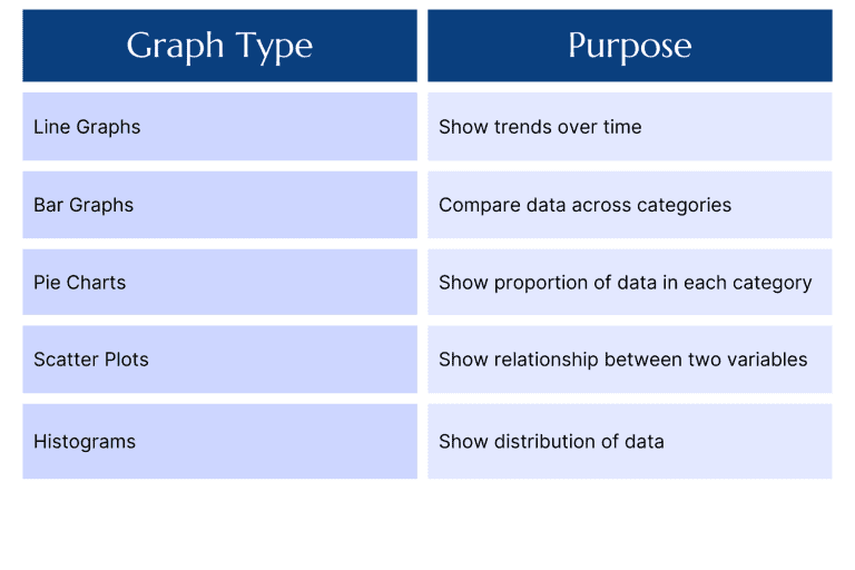
1. Line Graphs: Line graphs are used to show trends over time. They are ideal for showing changes in data over time or illustrating relationships between two variables.
2. Bar Graphs: Bar graphs are used to compare data across categories. They are effective at presenting specific categories of data to highlight the differences between them.
3. Pie Charts: Pie charts are used to show the proportion of data in each category. They are often used to illustrate how different categories contribute to the whole.
4. Scatter Plots: Scatter plots are used to show the relationship between two variables to show how changes in one variable affect another.
5. Histograms: Histograms are used to show the distribution of data. They are effective at illustrating how data is clustered around certain values.
Here’s a simple table summarizing these types of graphs:
Best Practices for Tables and Graphs
Here are some noteworthy best practices to present your data in a clearly and appropriately.
- Keep it simple: Avoid cluttering your tables and graphs with unnecessary information. Only include data that is relevant to your research question.
- Label everything: Ensure that all tables and graphs are properly labeled with descriptive titles and axis labels.
- Use clear and concise language: Use simple and direct language to explain your data. Avoid using overly complex terminology or jargon that your readers may not understand.
- Choose the right format: Choose the format that best suits your data. Use tables for presenting categorical data and graphs for presenting numerical data.
- Use colors and fonts: Use colors and fonts that are easy to read and visually appealing. Too many colors can be distracting for the reader.
- Use consistent formatting to make sure your readers can understand and compare the data.
- Use appropriate statistical analysis: While you can use graphs to show trends, statistical analysis can help to further analyze the data and draw meaningful conclusions.
- Consider the audience: If your audience is technical or scientific, they may prefer tables that provide precise numerical values. However, a general audience may find graphs more visually appealing and easier to understand.
- Choose the right software: There are many software programs available to create tables and graphs, such as Excel, SPSS, and R. It is important to choose the best software for the task to present your data clearly.
- Use consistent formatting: Consistent formatting implies that the same font, font size, and spacing are consistent throughout the document. It is also important to use the same formatting for similar data points to make it easier for readers to compare the data.
Conclusion
Tables and graphs are essential tools for presenting data in a clear and concise manner. As a master’s degree or Ph.D. student, you will need to use tables and graphs in your research to effectively communicate your findings. Remember to keep your graphs and tables simple, label everything, use clear and concise language, choose the right format, and use appropriate colors and fonts.