They say you shouldn’t judge a book by its cover, but most of us definitely do judge a book by its cover.
Sight is incredibly important to marketing, and the more appealing a book looks, the higher chances someone will pick it up and dive into the story you’ve so carefully crafted.
In short, a killer book cover design is a must.
Here are three ways to ensure your book’s appearance meets the standard of its contents.
#1 Know Your Market
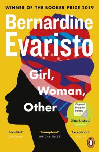
Duh. A colourful illustrated book is for children, while a serious photo on the cover indicates we’re dealing with a classic example of literary fiction.
Right?
Wrong. While photos used to play a large role in book cover design, illustrated covers have taken the publishing world by storm in the recent decade, and literary fiction is often as colourful as they come:
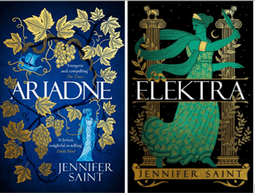
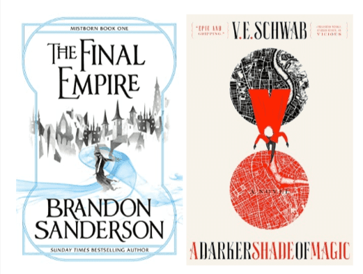
What’s more, specific genres or subgenres can sometimes be spotted by a book cover alone. Take the latest boom in Greek mythology retellings or the minimalist vibes that many fantasy novels give off:
By designing your book according to the trends of the current market, you’re automatically targeting your desired audience. People find comfort in familiarity, so make your book feel like home.
That doesn’t mean you shouldn’t add a fun twist, though! The more interesting, the better.
RELATED READ: How to Write a Successful Book Proposal with Lisa Tener
#2 Create the Perfect Blend of Visual Elements
A great book cover design mixes three major visual elements in an eye-catching layout:
- Images or illustrations
- Colour
- Typography
While all three can play a moderate part in the design, giving off a classic feel, the most fascinating covers prioritize certain elements.
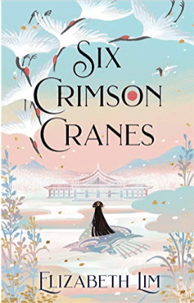
For instance, Elizabeth Lim’s Six Crimson Cranes – a fantasy book that has enjoyed wide success partly due to its gorgeous cover – prioritizes illustration and plays around with pastel colours to support the main theme of the story. The title and author’s name come second, complementing the already-established vibe.
On the other hand, Beautiful World, Where Are You by Sally Rooney brings forward typography, adds an extra element via illustration, and leaves colour last – with a simple blue background, we’re better able to appreciate the title.
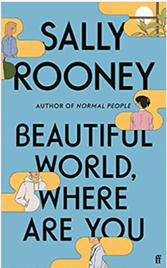
Some editions of this book have also come out in green or yellow, underscoring that colour plays more of a minor role here.
Lastly, The Vanishing Half by Brit Bennett is a burst of colour that immediately catches your eye. Meanwhile, typography is used to support the book’s title – the words seem to be vanishing among all the intense colours – and abstract illustration is used as a canvas for the colour element.
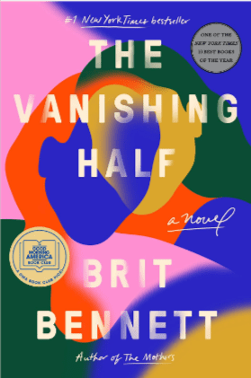
When considering which element you should prioritize, remember to research your target market; Beautiful World, Where Are You and The Vanishing Half are classic examples of how literary fiction is portrayed nowadays, while Six Crimson Cranes makes for a magnetic fantasy cover.
RELATED READ: A Guide to Book Pricing for New Authors
#3 Don’t Forget Spine Design and Fore-edge Painting
After readers finish a book, they want to find it a cozy and fitting place on their shelf. This is where its spine plays a major role – does it fit the vibe of the front cover? Does it stand out among the other books? Does it fit the genre?
When designing a spine, include all the important information: the title, the author’s name, and the publisher or logo (you can add a fun little element if you’re self-publishing).
Next, ensure the spine elevates the overall cover. Some of the best book designs comprise a continuing illustration that crosses the spine seamlessly and continues to the back cover. If you’re writing a series, it’s vital that your book spines fit and are satisfying to look at.
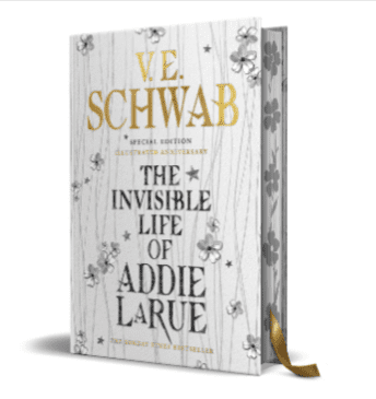
Fore-edge painting – putting colour or an illustration on the edges of book pages – is more of a bonus than a necessity, but that’s exactly the reason your book will stand out. The anniversary edition of V. E. Schwab’s The Invisible Life of Addie LaRue, for example, contains flowers that perfectly complement the hardback design hidden behind the book jacket cover, bringing the overall feel of the story to a new level.
So, What Makes a Compelling Book Cover?
Now that you know the three secrets of a killer book cover design, what makes it the most compelling it can be? What gives it the je-ne-sais-quoi?
It’s the way in which the cover corresponds to the story inside. While it ought to attract attention and be aesthetically pleasing to look at, the cover should perfectly fit the atmosphere hidden between the pages.
It’s not just the theme or genre that should be defined; it’s the soul of the story. Breathe life into your design, and watch it flourish.
Conclusion
Of course, it is always the words that matter most when it comes to books. However, a fantastic book cover is how you attract readers in the first place.
A book cover shouts from the rooftops, “Come and read me! Come and discover what’s inside!”
The story, on the other hand, whispers: “See? I told you. I’m amazing, aren’t I?”
Combine the two, and you’ve got yourself a potential bestseller.